
Coding With ChatGPT - Week 3: Content, Carousels and Forms
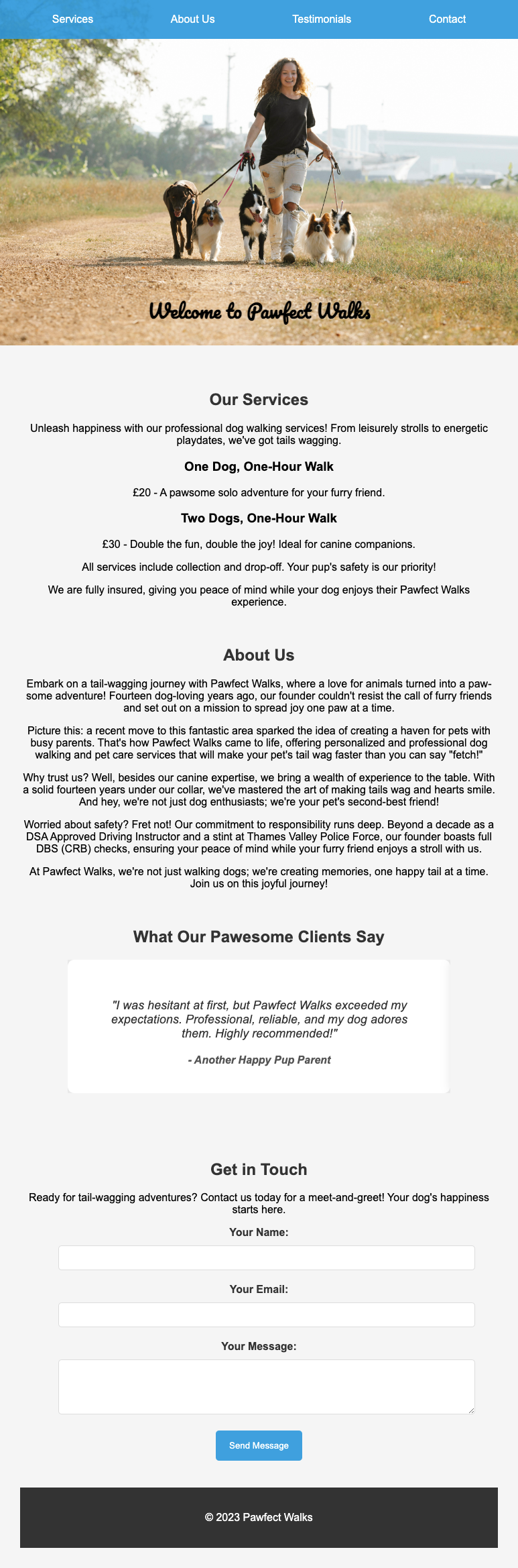
Welcome to week three of coding with ChatGPT, as with week 1 and week 2, follow along by reading through the full conversation with ChatGPT that is solely being used to produce the website. By the end of this week, this is what you should have:
Here’s the link to the chatGPT conversation: https://chat.openai.com/share/daecdd6d-7462-4750-ab27-a90e4d883af0
Read this article in conjunction with the chatGPT conversation taking note of how I’m communicating with ChatGPT. We are only using 3.5 to show it’s possible without having to pay a premium (although you’ll get a better output from 4).
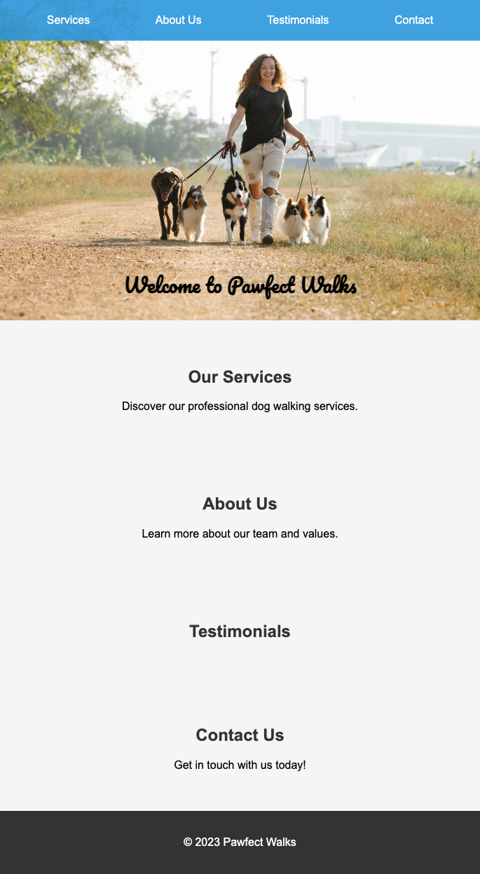
If you followed week 1 and week 2, this is what you should be starting with:
If you haven’t seen week 1 and week 2, catch them here:
Week 1: https://www.thepromptindex.com/6532e37b16dda.html
Week 2: https://www.thepromptindex.com/653ec3c0616c1.html
I’m starting a completely new conversation for week 3. Luckily, the website's HTML fits within the context window as it’s only a small site so I could just copy it all (Ctrl + A, Ctrl + C), however, this isn’t always going to be the case. To be token savvy, we only need to copy and paste in the code from the header to the footer as this is where our content is going to go, there’s no need to copy and paste all of the website's HTML. Along with the code, I gave my instruction, which was a happy go lucky styled tone that really sold the dog walking service whilst at the same time ensuring that potential customers felt confident with the service.
The content was ok, but needed a little improvement, (adding a human touch to any AI generated content is always a good idea, things like prices and anything else). Another tip, get inspiration from other websites, use their copy to feed into chatGPT and ask it to use that as a guide (but express the fact that it shouldn’t copy any of it to avoid copyright.
So here’s our content so far, looking a little better, as this is a quick run through and just to showcase an example this is fine, but in general, I’d recommend spending much more time on getting the content perfect for your website:

Whilst updating the content, I noticed the text runs right up to the sides of the screen. That doesn’t look good at all, so that’s what I fixed next by simply explaining what I’ve just said “I want a little space on either side”.
It gave me the code back, and it all looked the same, except it’s added a wrapper div around my content by adding `
<
.wrapper {
  max-width: 1200px;
  margin: 0 auto;
  padding: 30px;
}
>
It worked like a treat.

However, I wanted to increase the padding a little more than what it gave me, so I just changed the padding from 20px to 30px.
I used this new-found information about padding to track down the huge gaps between the sections. I went to my CSS style sheet and identified the section styling
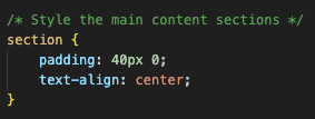
…and changed the padding from 40 to 10.
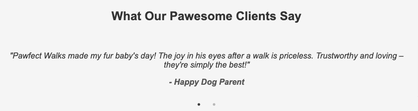
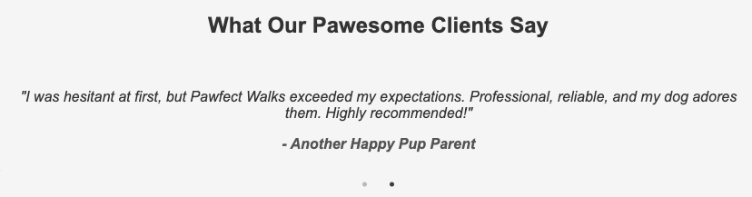
Now that the padding is much better, let’s add a nice little feature that scrolls through the customer reviews every 5 seconds.
I grabbed the code straight from Visual Studio code, specifically it was this section of code:
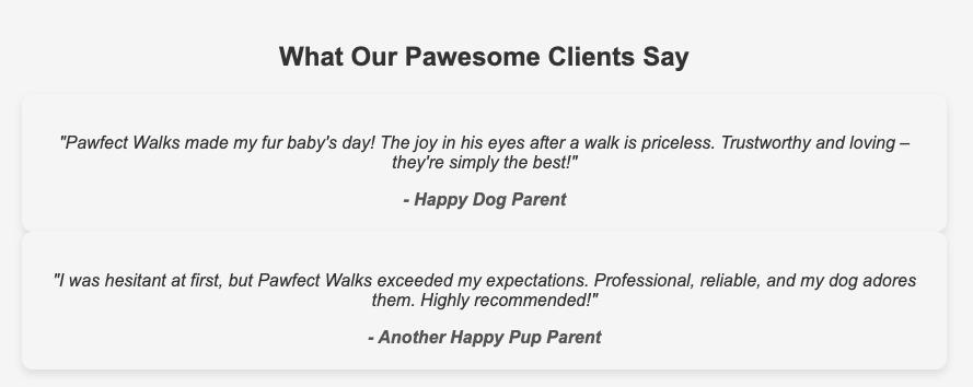
    <section id="testimonials">
      <h2>What Our Pawesome Clients Say</h2>
      <!-- Add customer testimonials here -->
      <div class="testimonial">
        <p>"Pawfect Walks made my fur baby's day! The joy in his eyes after a walk is priceless. Trustworthy and loving – they're simply the best!"</p>
        <cite>- Happy Dog Parent</cite>
      </div>
      <div class="testimonial">
        <p>"I was hesitant at first, but Pawfect Walks exceeded my expectations. Professional, reliable, and my dog adores them. Highly recommended!"</p>
        <cite>- Another Happy Pup Parent</cite>
      </div>
    </section>
I explained to ChatGPT I wanted a really sleek carousel style to show off the reviews from customers.
It gave me the HTML, Javascript, and CSS, but it didn’t work.
As you can see, it’s still the two reviews one above the other, clearly not working as intended. So if you come across an issue, whilst this is a simple issue, here’s how I approached it and you can use this approach (it may need to be iterated a few times) to find a solution:
- Firstly, I explained that it wasn’t working as intended, describing the fact that it was static (This helps ChatGPT narrow down potential issues and speed up the time it takes to resolve it)
- It suggested a more up-to-date CDN which is an external library, it also provided new code which I used to replace the existing code, follow ChatGPT’s instructions.
- I tested the new code, and it was partly resolved, but it wasn’t cycling through the reviews fast enough, so I simply asked how I could speed it up. It highlighted the exact setting I would need to change and gave a suggested new setting.
I was tempted to stop there and move on, but for the sake of 2 minutes, I wanted to add better styling, so I refreshed ChatGPT’s memory by sending it back the HTML for the carousel section along with the CSS and said “Let's really make this carousel of reviews stand out. I want a sleek, polished carousel review section that grabs the visitors' attention here's the HTML and CSS, let's see what you're capable of, use the latest styling techniques and best practices”
I updated it based on what it came back with and it added a hover feature which slightly increases the size of the text and makes it pop move when you hover over the review

Ok, so we have the carousel sorted with the reviews, let’s add a nice little form to allow potential customers to get in touch. I asked “Ok now let's add a way for potential customers to get in touch.
Here's the section I want it adding: (then I copied the contact HTML section to refresh its memory)”
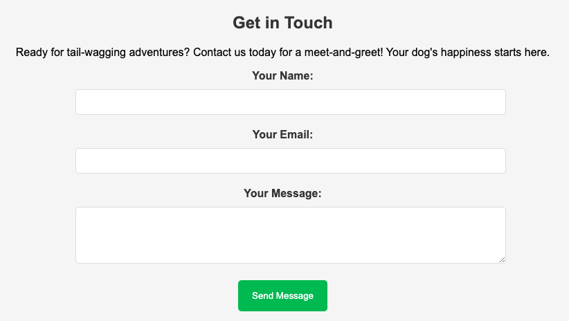
It’s nice but I wanted the button to be the same colour blue as the nav. So I went into my styles.css file and looked for the nav styling section and looked out for a blue colour which I found here:

I took that bit of code and copied it into ChatGPT saying I wanted that colour for the button on my contact form, specifically I said “perfect, I want the #contact button colour to be the same as the nav colour which you can see here: (I then show it the nav styling)”

Perfect!
It’s important to note that proper validation should be configured on your form, to stop potential SQL inject and malicious code being sent through your forms and into your database, server-side language needs to be added to send that message to your email address, for example. It’s very important to periodically ask ChatGPT to review potential security risks and improvements that can be made to any site you make.
We are going to leave it there for Week 3, and we will carry on building this project into Week 4.
There’s still a long way to go, but you have to admit, it’s starting to come together now, and this could be produced in 20 minutes, imagine actually knowing how to code and using this to speed up code production.
Let’s recap what we’ve naturally covered this week:
- We used ChatGPT to generate content, we fed it content from other sites and made manual adjustments.
- We added a carousel and overcame an issue with it not working on the first attempt by providing ChatGPT with as much detail as possible.
- We added a contact form, discussed potential security issues, and used existing styling to use as an example to match the colour of the nav bar to the button.
Hopefully, by now, you’re starting to get accustomed to HTML and CSS and it’s starting to make much more sense, don’t be afraid to play around with the code and just refresh your site and see what change it makes, if it messes things up or makes things worse, just simply undo what you’ve done by pressing ctrl-z within VS Code.
Next week we will look at improving the overall styling further and optimizing it for mobile ensuring the site is mobile responsive.
If you’re enjoying this series, please feel free to share the blogs with those who you feel will find it interesting and if you haven’t already, please sign up for our weekly newsletter if you haven’t already:
Thanks for reading!